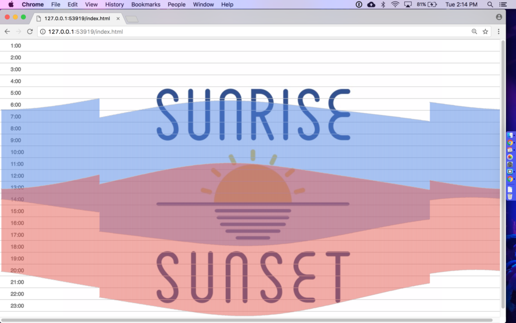
Above is a little illustration that depicts the sunrise and sunset times (listed on the y-axis) of two locations in the world for each day in the year (spread across the x-axis).
See the code and web version here (press the play button – not optimized for mobile).
In this current case it is the 2016 sunrises and sunsets from Eastern Standard Time (EST) – aka New York – and Central European Time (namely Switzerland & France).
At many stages in my life, for different reasons, I have found myself doing a mental calculation to imagine this time difference, and specifically when our normal waking hours overlap.
These days, both a friend and my girlfriend’s father are stationed in Switzerland.
This illustration is designed to show that our days share a lot of the same sunlight – especially in the summer. So even if we are far away, we can often look up at the same thing in the sky.
This project was created based on a prompt to load data into a p5 sketch. The sun data comes from the United States Naval Observatory in Washington D.C.
GETTING GOOD DATA
The decision to use this data did not arrive immediately. Getting ‘good’ data was a challenge for a few reasons:
- APIs – Documentation: After a foray into APIs with the APIs to LEDs series, it should be easy to use any API right? Wrong. An attempt to work with the MTA’s ‘Data Mine’ API left me frustrated because it was not easy to tell where to start. Getting a key was simple enough, but the ‘documentation’ often went in circles and loops of hyperlinks, without providing many – if any – concrete examples.

Data from the MTA with an unknown structure, opened in a text editor - Historic data – Accessibility: Good old static historic data was also a little hard to come by. Again the MTA falls short with their subway lines historic data, which I could not get to provide data for certain days. To see what I mean, try to get the data for Halloween last year (2016-10-31).
Once settled on the sun data, new challenges and decisions presented themselves. The data, though simple in structure, was served on a page like this:
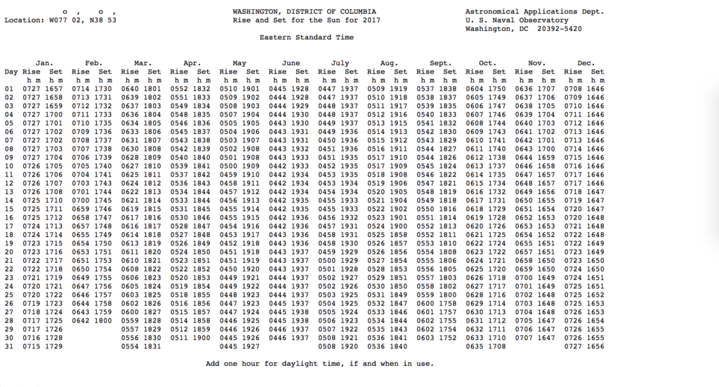

Even if this were served as some sort of space-delimited file, it still wouldn’t be easily digested into a program. In fact, the website recommends to “copy the numerical part of the table (i.e., do not copy the table headings) from your browser and paste it into the text editor”. While the data is free and clear, its not clean.
CLEANING THE DATA
How to clean this data was the first decision posed by the format. To make the sketch very modular, it would be best to do all data sorting within the Javascript portion of the sketch.
But to do this conversion, manipulation, and calculation would have been time-consuming. Additionally, even a small change to the formatting of the file might make the code defunct.
Instead, I returned to an old, dear friend to handle it – Microsoft Excel. After a few clicks, drags and keyboard shortcuts, the data was in CSV format.

VISUALIZING THE DATA
The next interesting challenge was trying to express the visualization in my head through the code.
A. Color! To show the time-zone overlap as a beautiful thing, I used HSLA (Hue, Saturation, Lightness, and alpha) values so that different colors would lay on top of each other nicely. There are actually more colors in the sketch that you can swap in and out – find their values in the setup function:
B. Flexibility. Again, decisions about how modular and flexible the program should be rose quickly. Should the program present an option to choose from multiple countries? Must it have a pre-loaded relational list of timezones? What common variables should the functions rely on, and which should be avoided? For the most part in this sketch, the option to make it flexible in the future is still there, but there will always be new challenges making it more universal.
C. Accuracy of information. Writing functions like drawTimes() took a lot of reliance on short-term memory for tasks such as recalling what a set of 365 values should look like after it has passed through a conversion.
Sometimes short term memory failed me – in an earlier version of the sketch, I had the visualization completely off (by 3 hours, in 3 different places) See here:
The sketch was showing something nice, but not an accurate mapping. I imagine for more advanced data programs, there are functions or even entire scripts that solely check for data accuracy.
D. Visualization versus information. Considering the sketch above versus the final version, you can see information such as the season icons were added to give more context to the work.
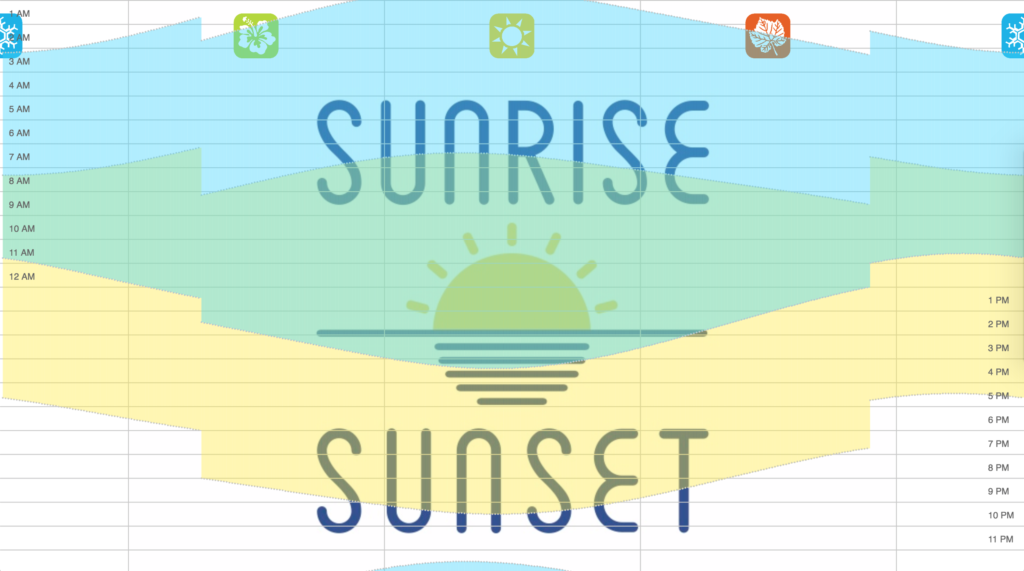
I’m not sure if the icons and times on the y-axis are worth their detriment to the simplicity of the color layers. You can take out the outlines and other labels in the function by commenting out the drawAxis(), drawOutline(), and drawWeather() functions.
Thanks for reading. Below are some screenshots of the sketch as it evolved from data points to ‘art’ 🙂 Credit to Sunrise / Sunset in Brooklyn for their image, USNO for the data, and openclipart.org for the weather icons.


