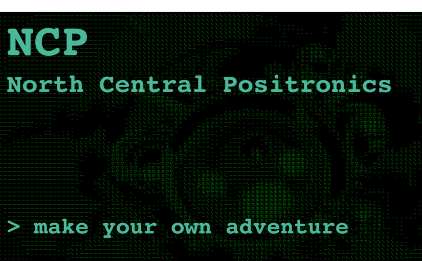
Note: This post expands on the process of design & creation of my thesis project.
I knew I wanted to make a text adventure game from the very beginning. Below is the first iteration of my idea.

⏩ Fast forward four months and…
- The plot is pretty much the same
- The concept is further refined
- Behavior driven development was used
- Womp womp, there’s no NLP (natural language processing)
- The game is created using MediaWiki, deployed through Heroku
⏪However, wind back those four months and:
- I’ve never made a game before – but have a basic understanding of game design thanks to Frank Lantz and Charles Pratt thanks to the Games 101 course, and my pure love of games
- I’ve made plenty of web apps, but none of them as robust (or secure) as this would have to be
- I am scared and excited. Unsure of how to make the game, if people will use it – or worse – if people will even “get-it”
Note: This is a long post so feel free to jump to what interests you:
Early Concept
⏮ Wind back another two months, and you will find my first expressed version of the project at ITP’s “gong show”:
Big ideas, right?! Similar to the poster above, we also collaborated that day to put ideas down on paper:

Developing Concept
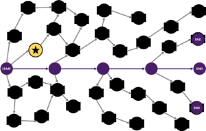
More than anything I had this vision stuck in my head that the game universe will continue to grow and evolve to answer this question. Inspired by my work with networks, I converted the vision into a GIF:
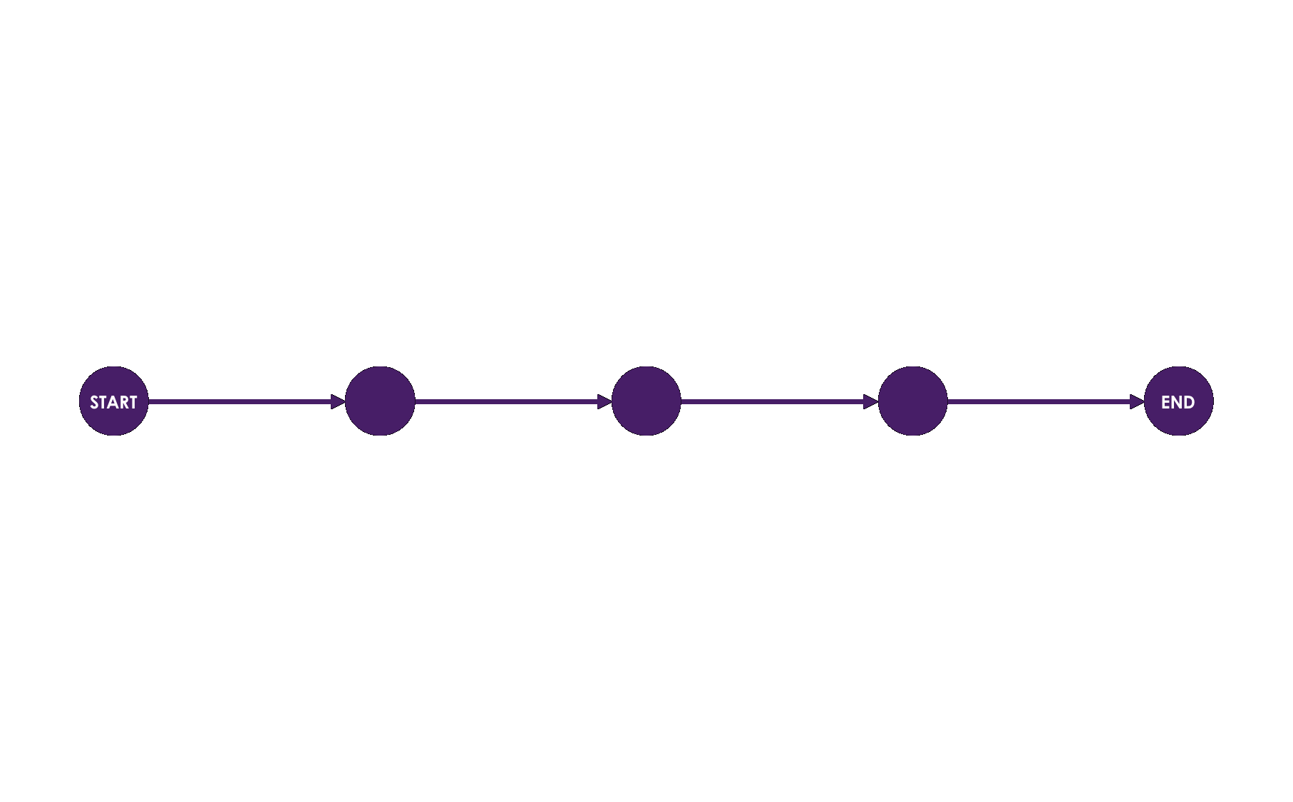
The game would start as a simple linear narrative (purple) and expand into a universe of user-generated content and connections (gray).
I also made a cornell box to express and visualize the aesthetic behind my project:
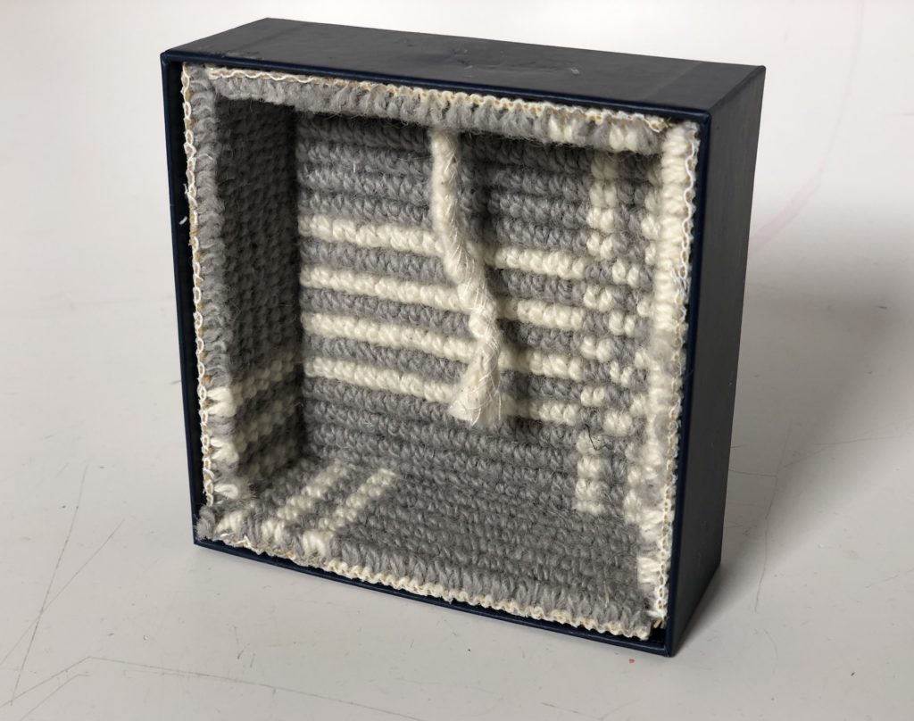
The aim of the piece is to incite a devious curiosity within the viewer. When we see something like a button, a small part of our mind want’s to push it – even if we don’t know what it does. The same goes for loose threads in material like the one above.
The message behind the content and form – to quote J.P. Prewitt from Zoolander – is:

“Keep pulling the sweater, eventually the whole thing will unravel…”

The box overall is a neatly organized set of threading in rows and columns, organized within a perfect square – with this one dangling exception.
Pulling the thread could potentially undo this organized patchwork, methodically sewn together into conformity; and yet we may be tempted to do it – perhaps just to see what happens, or maybe to intentionally deconstruct.
This is the same approach and message that I want to come through in my project.
Project Plan
One thing I knew for sure was the sooner I got the game ‘out’ to the public, the better it would be in the end. This concept applies to almost any project: TEST EARLY AND OFTEN!
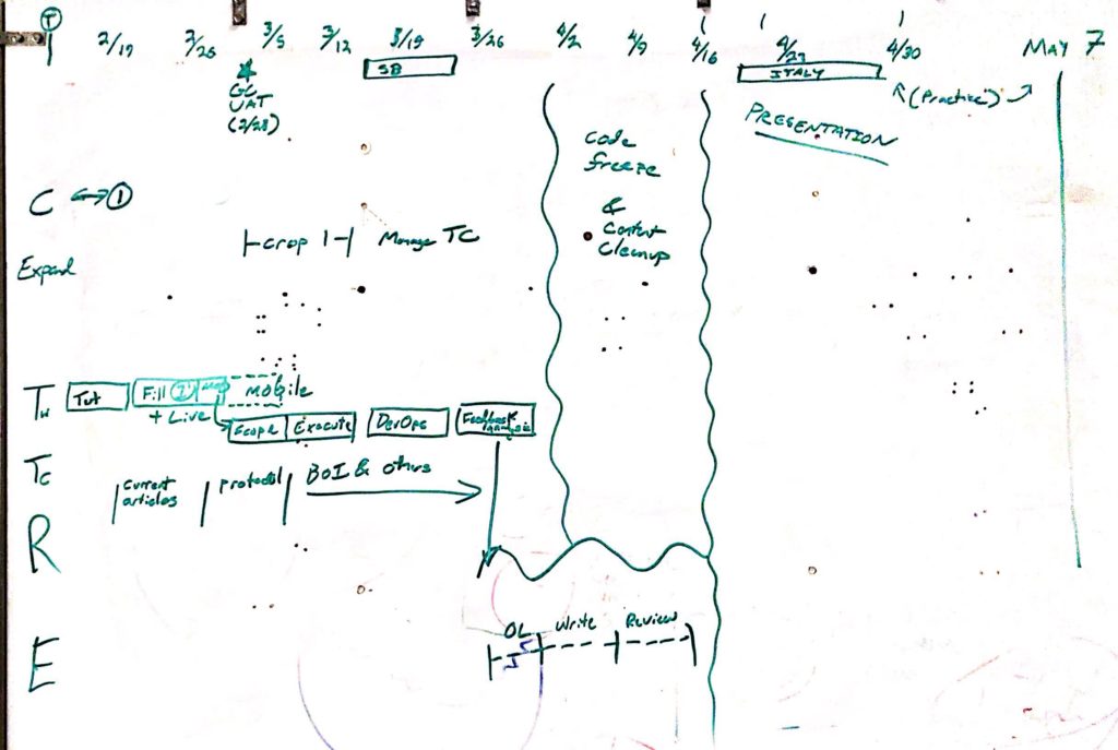
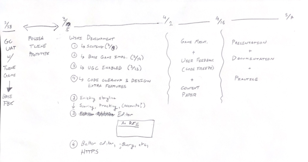
So in creating project plans I was very focused on releasing the game ASAP; while researching and refining the hows and why’s along the way. Here was the first plan I made
I did manage to release a version of the the game in time for the user testing on February 28 – but in the end, this version was a just a prototype. It was created in Twine and deployed through Heroku.
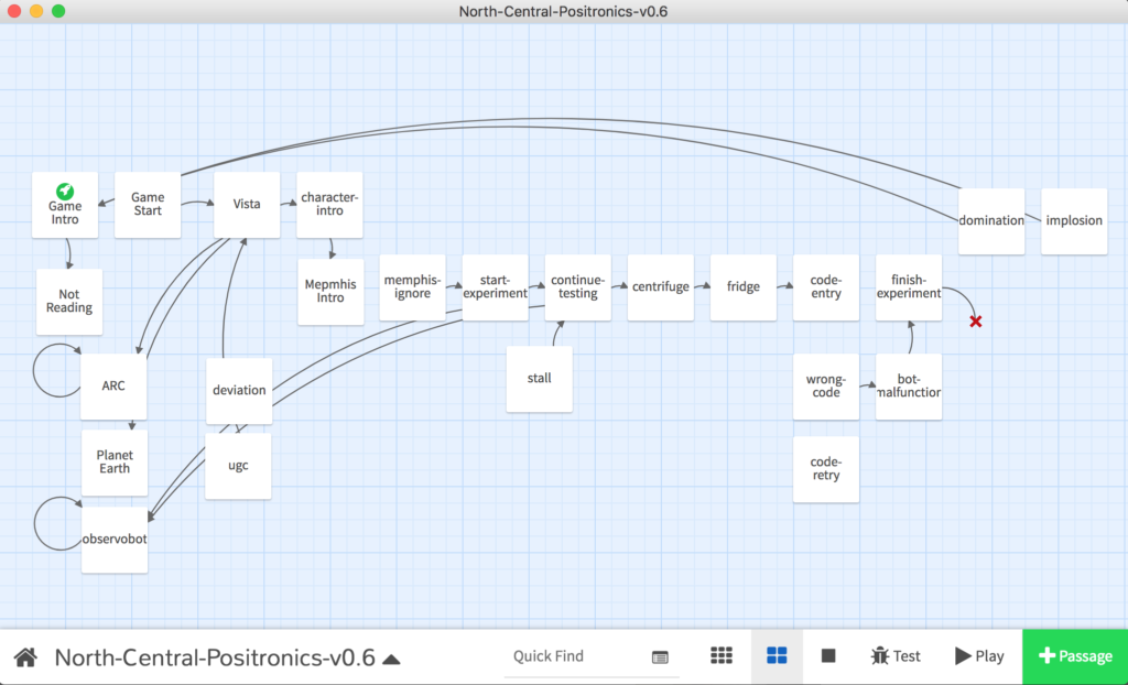
Twine was great for creating the base narrative of the game. Here’s what the game looked like at the time:
However, Twine wasn’t really capable of updating itself with new content. Instead, I would have to collect user responses and manually add them to the game (see the project GitHub for more info on this). This was not sustainable, and not true to the concept behind the game.
Truly stuck and frustrated, I met with Allison Parrish, who suggested I use a wiki 💡
A wiki? Like wikipedia?
Yes fam, a wiki – like Wikipedia. Unintuitive at first, it actually makes perfect sense for what I needed to accomplish. I made a new plan to accommodate this change:
Wiki Research
The only problem with this plan was that I had no idea how to make a wiki. It turns out there are many different kinds of wikis. I have to thank the folks at WikiWorks (specifically Yaron Koren) for pointing me to the right one: MediaWiki.
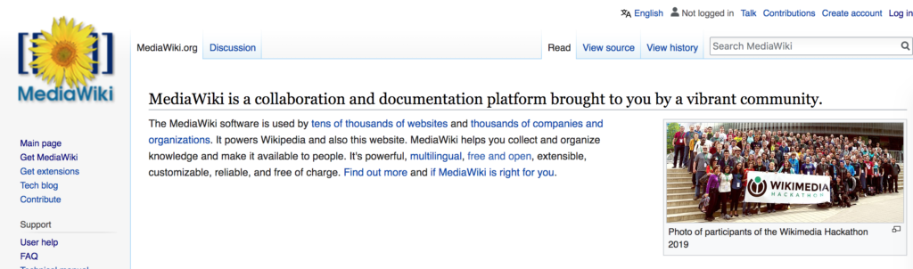
MediaWiki is the same software that powers Wikipedia and I focused on using it because of this recommendation from Yaron:
"I still think MediaWiki is the best choice for this - actually, I can't imagine you creating your system with software other than MediaWiki. The specific interfaces may or may not require custom programming - the following extension may be helpful:

https://www.mediawiki.org/wiki/Extension:InputBox"
MediaWiki also seemed like it would work because:
- It had many extensions – add-ons like InputBox mentioned above that would allow me to introduce the game mechanics and features I desired into the game.
- It allowed for anonymous page creation – essential to capturing as much audience as possible for the game and also aligned with the devious curiosity I hoped to incite.
- It has an active developer community – this would turn out very helpful for debugging, but also carries an ethos similar to the rhizomatic, collaborative platform I envisioned for the game universe.
You can read more about how the wiki was developed here. The rest of this post will focus more on the game itself.
Research & Inspiration
Alongside developing the game, I researched game design, network theory, and various recommended media for ideas and inspiration.

I outline how some of that research informed the project here, but wanted to highlight all the material that played a role.
Games – games that encourage choice and creativity
- Sid Meyers Civilization
- The Stanley Parable
- Dungeons & Dragons
- Kentucky Route Zero
- BioShock
- Oblique Strategies
- The Plan
Film & TV – Sci-Fi that transports us to a different world
- The Matrix & Animatrix Series
- The 100 (TV series)
- Nineteen Eighty-Four
- Snowpiercer
- Star Wars
Books & Articles – writings about modernity, technology’s social implications, game design, and more sci-fi 🤓
- A Thousand Plateaus
- Protocol: How Control Exists After Decentralization
- The Master Switch (Tim Wu)
- The Machine Stops
- Beginning of Infinity (David Deutsch)
- The Private Eye
- Game Design as Narrative Architecture
- Why Adventure Games Suck
- Rethinking Convergence Culture
- Game Design for Problem Solving (UConn)
- Ender’s Game
- Ready Player One
- The Dark Tower Series
- Super Sad True Love Story
- Hitchhiker’s Guide to the Galaxy
- The White Album (Didion)
Talks & Videos
- Understanding participation in Wikipedia (Martina Balestra)
- Gaming for a better world (SuperBetter)
User Testing
I performed roughly three rounds of user testing throughout the semester of making this project.
A first round with the prototype:
A second round with the beta release:

… and a third round with THE INTERNET:

The notes and lessons from user testing are numerous, invaluable, and made the game what it is today. USER TESTING IS MAJOR KEY 🔑and here are some of the results that helped the game evolve:
- Concept Priming
- Game History & Progress
- Tutorials & UI
Concept Priming
Some players would only ever click on links, never straying from the linear narrative of the story.
This behavior was fine to me, as my intention was to encourage players to try something else on the second play-through after seeing the dark/disappointing endings offered by the main narrative.
However, many players would stop after one play-through. Even though the game only took 3-5 minutes, players were not motivated to try again and explore the other options or text box – missing out on a big part of the game.
Trying to balance playing time with game comprehension, I opted not to make an entire intro tutorial but instead a negative priming mechanism at the beginning of the game.
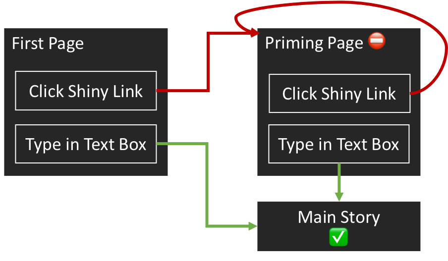
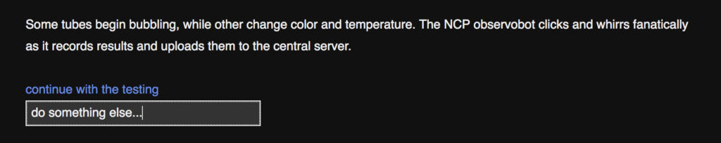
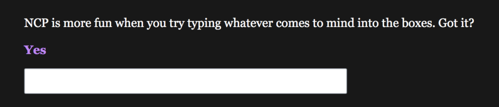
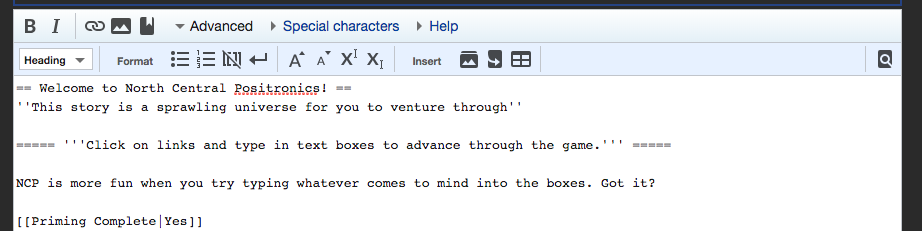
Player’s who don’t type in the text box on the first page are trapped in a loop until they do so. The first prompt looks like this:
If a player simply clicks “Yes” – and quite a few do – they are sent to a looping priming page that looks like this:
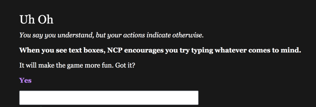
After finally typing into the text box, players get positive messaging and are invited to start the game:

Many testers commented on how useful this priming was in discovering the ‘make your own adventure’ aspect of the game. Some also helped me introduce the right level of negative and positive reinforcement into the messaging.
Game Progress & History
While playing, many testers would ask “Where am I?”

When transporting a player to a remote time & place, this is a big question. The game contains lore to give further context upon exploration, but didn’t have any sort of map or guide about their location within the game universe.
This feedback inspired a few ideas:
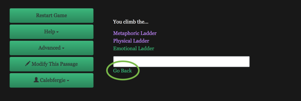
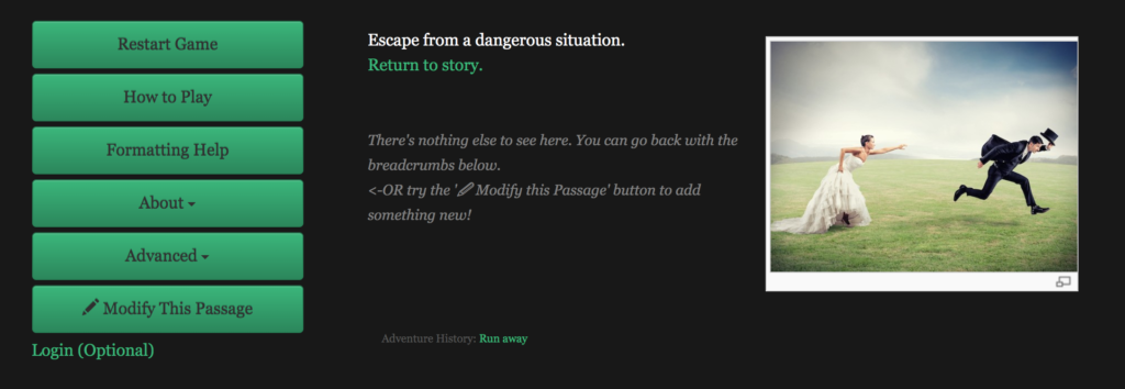
Provide a ‘go back’ button so that players can be reminded of what they just chose, or to revert a decision.
It wasn’t clear to testers that you could just click the browser 🔙 button, so I added some code that created “Go Back” links:
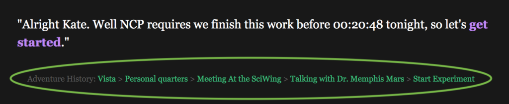
Provide breadcrumbs. Iterating upon the positive response from the Go Back button, I also added to breadcrumbs at the bottom of every page
Provide a ‘network map’ similar to the network gif at the very top of this post.
Testers agreed this would be very helpful, but still have not figured out a way to implement it.
What Now?
Many play testers were confused or intimidated by making their own adventure.
If anything, this was the most important lesson I learned from making this game and about game design in general, and remains a persistent issue that still isn’t fully solved.
Still, user testing helped me recognize UX needs and make this process easier for players.
KISS (Keep It Simple, Stupid) 💋 – Simplify the UI as much as possible even if it means hiding cool advanced features
Play testers were almost always looking for fewer, clearer editors in a ‘normal’ font.
v1 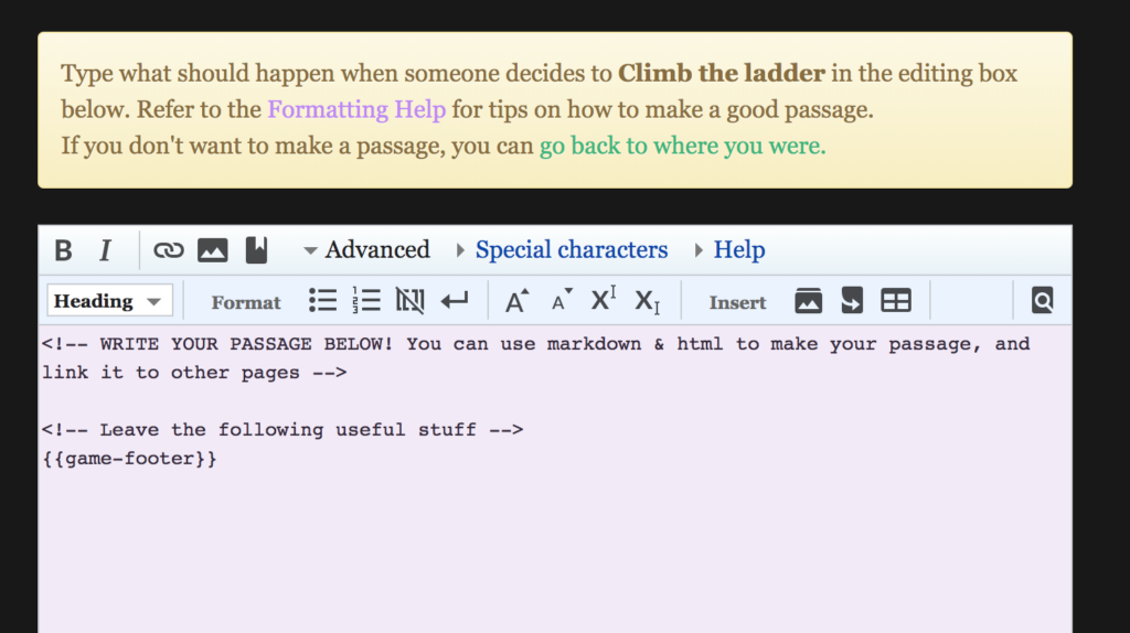
v2 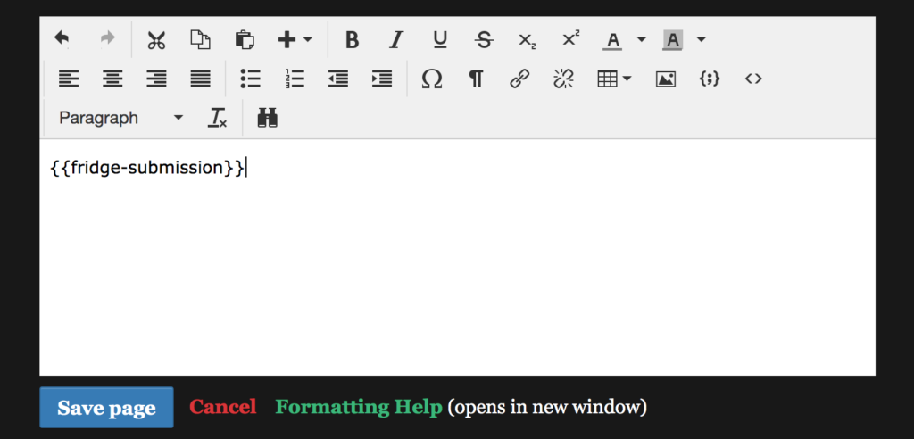
v3 
current version
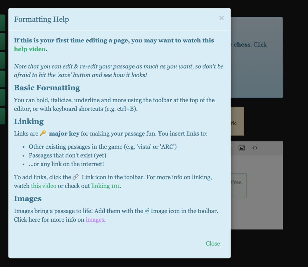
I added layers of informational modals as well, so there is more info on-hand:
A picture is a thousand words 🖼 – use pictures and videos to engage.
I noticed users engaged much more with multimedia passages. They would read more on the page with pictures – so I added more pictures, gifs, and youtube videos to the game.
…and also created tools so other players can do the same.
As a result, other players actually did start to add their own pictures and videos:
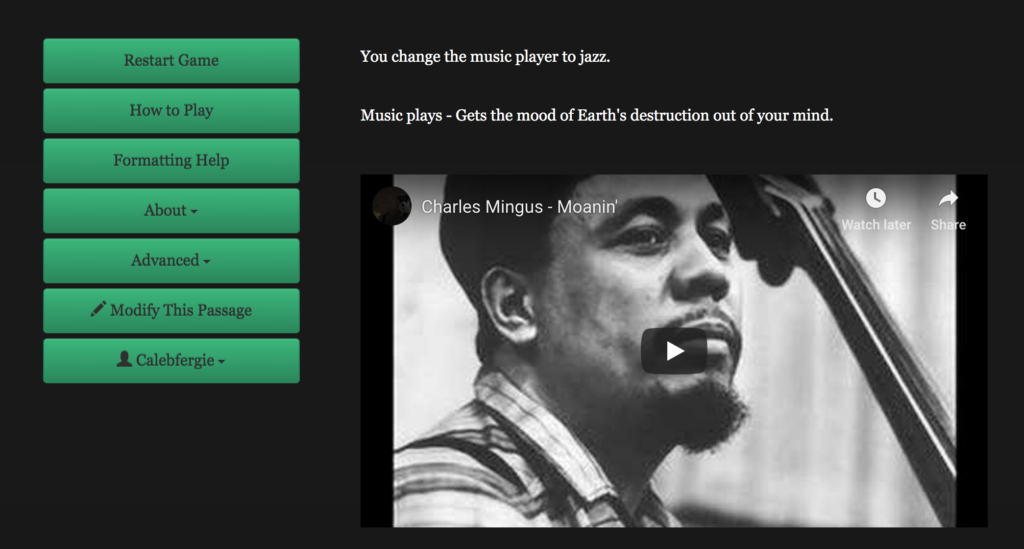
A video is a MILLION words 🎬
Finally – more than anything, play testers wanted a tutorial. Which makes total sense. The game could not speak for itself. So I made a series of SHORT (very important) video tutorials.
This also helped greatly for when I released the game to the INTERNET – anyone playing online could get a good explanation.
And so THANKS A MILLION to all the testers and players 🙏They helped me make the best design decisions possible. Couldn’ta done it without ya!~
One reply on “Building NCP – Concept & Design”
[…] project is secretly a wiki, just like Wikipedia! You can read more technical details here or check out the GitHub repo […]