Last week I went to the American Natural History Museum through the lens of a museum/exhibit critic.
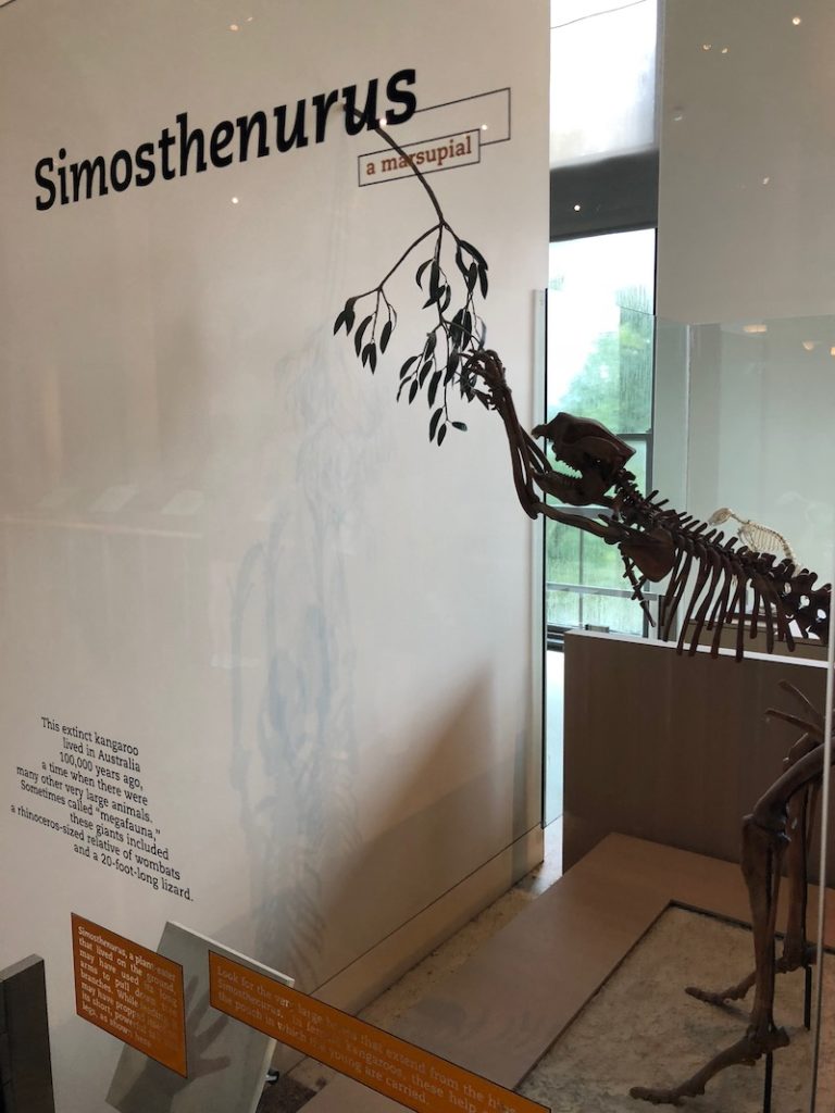
I remember as a child and young adult the museum seemed impossibly big. Yet this time, through this lens – and thanks to the dozens of other times I’ve been here – the space was totally manageable.
Below are my notes and responses to the prompts from my class.
Outside the Museum
- Extension of the park into the subway station
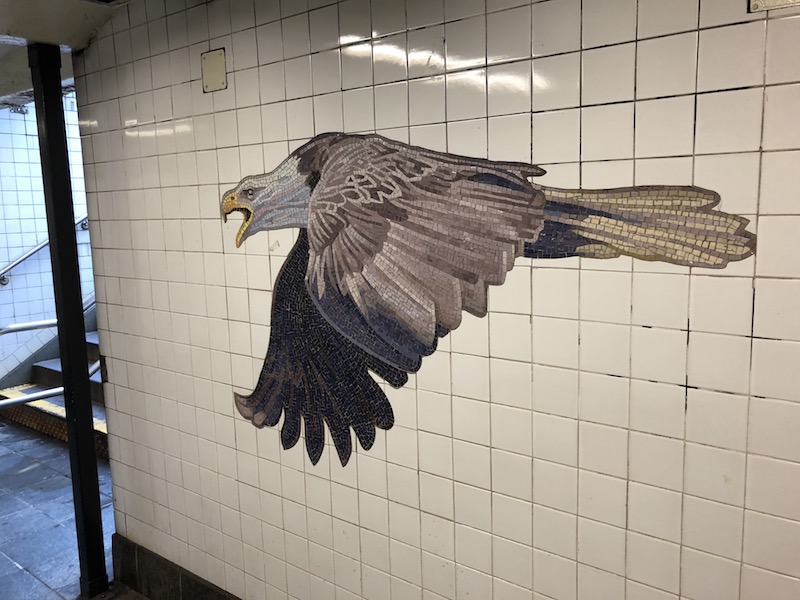
- On one side, beautiful green grass and shade, on the other, 80 million hotdog and halal stands
Prompt 1: How does it feel when you arrive. What’s your first emotional response? Please note that monumental sculpture at the Central Park West entrance. Write down what you see. Right there…don’t think about it, don’t put it off
- Walking up to the museum, I feel like I am going to the library – big columns and stone steps
- B-E-A-U-tiful buildings buttressing the museum
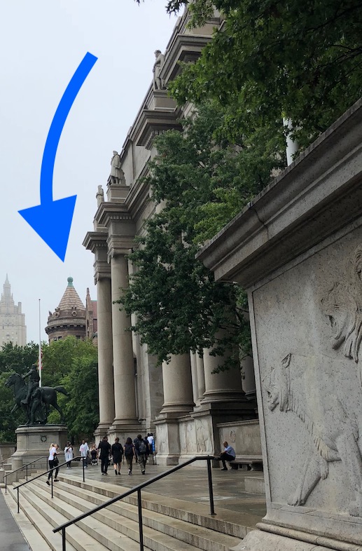
- The large statute is big stick Teddy Roosevelt on his horse accompanied by natives of some kind NOT on horses – feels a little white and elitist
- Bigass bison are the most noticeable animals also v American
- At first I thought all the words lining the entrance (SCHOLAR, WARRIOR, etc.) were description of American people and culture, but I guess they’re just praising Roosevelt
- Asians with iPads taking pics
Entrance
- Raptor facing me front and center! Is that you blue?
- Helpful security, though it created a bottleneck
- Self serve tickets? Sweet, no more guilt… JK you have to pay full price if you want to use the self-serve system.
- Its cold waiting in line…
- Lost immediately after being funneled into center area. But i got a map and I like the map design, one fold, one floor
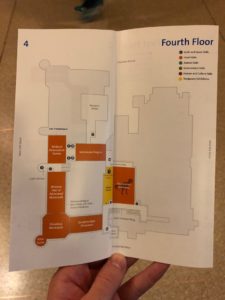
Prompt 2: Wander for about a while. Note what catches your eye. Write it down.
- Kinda dark in here, no?
- MARBLE, bronze, highly classical design
- With a map, formally studying the place seems smaller
4th Floor (Dinos)
- Evolution! Sooo many words, panels, and diagrams. Using big question sentences to draw me in. Like ‘did stegos have two brains?’
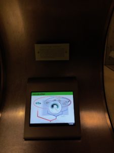
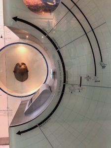
- I love the ancestry charts and organization, and these kiosks that focus on types of vertebrates. However, there was at least one of these that was unresponsive (I really wanted to learn more about turtles but could not)
- I like that there are exhibits on the process for getting the dino bones – a practical science lesson 👍
- Just now seeing these arrow paths, am i going the right way?
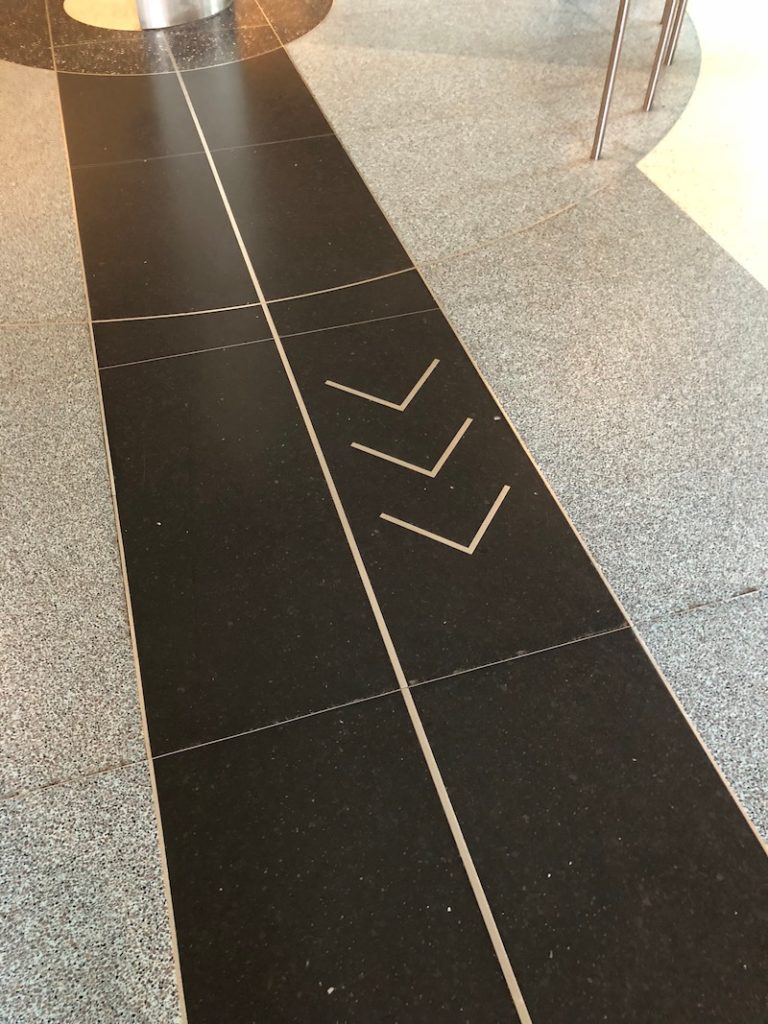
- …no, I was definitely not going the right way, but the experience was still nice
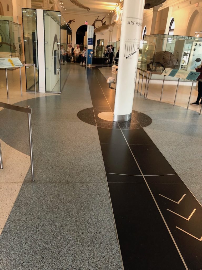
- Cafe on 4th floor has old school cafeteria vibe, ski-lodge crowded. Cafe 1 was more modern though
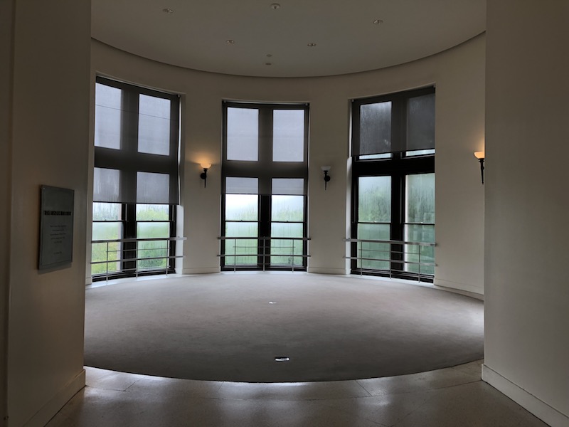
- Astor turret – love it – gave me a chance to breathe
- Standardization of diagramming making it easier to compare categories
African Mammals and Other Animal Exhibits
- On to African mammals, again, very DARK in here. Very much about the exhibits, not the space/crowd of people around them.
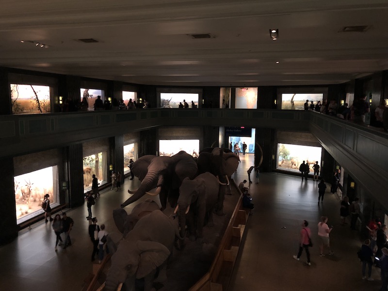
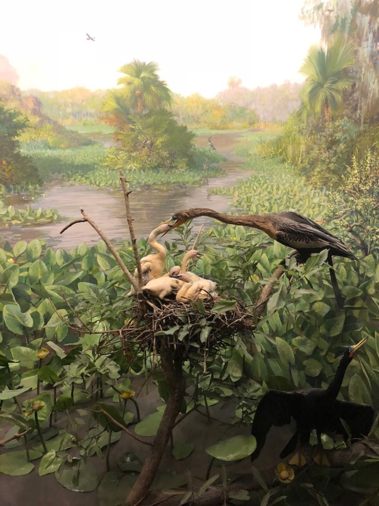
- Panorama backgrounds create depth
- Employees coming out of unmarked doors, consideration of the operations side of things
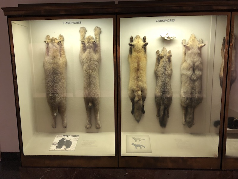
- Something about stringing up the mammals (especially carnivores) seems messed up, dominant. They are so neatly hung-up…
Prompt 3: Then imagine it’s actually a museum of the history of exhibit design. The first major exhibit is still on view ( Hall of Northwest Coast Indians, 1896). As a history you can notice changes in a society’s biases, politics, assumptions of truths. Check out this site to get an overview of the history
Is there a question here? I was surprised to discover just how old this museum is (The current building being built in 1874) – and how old the Hayden Planetarium is (built in 1935).
Prompt 4: Pick one of the older cultural/anthropology halls. How would you update them without changing the exhibits. They are landmarked.
I picked the “Stout Hall of Asian People” – It is a stale exhibit that sounds racist at first glance (Stout is a donor). The exhibit is designed to be a geo-spacial journey through ‘Asia’ – In other words As you walk into the hall you travel further east (ultimately ending in Japan) and then wrap back around, heading west.
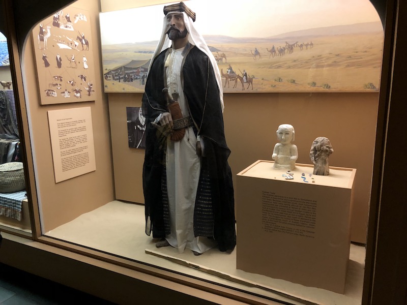
Writing critically, the exhibit feels very 1990’s and cramped. I also feel overwhelmed with trinkets.
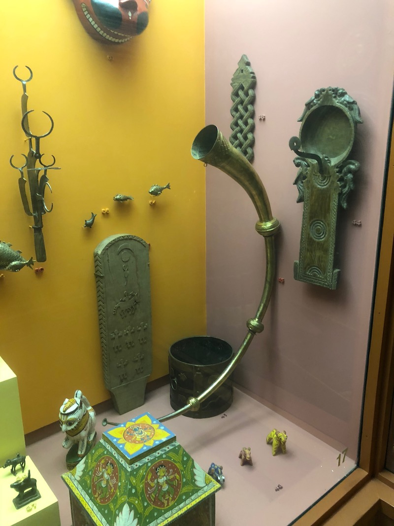
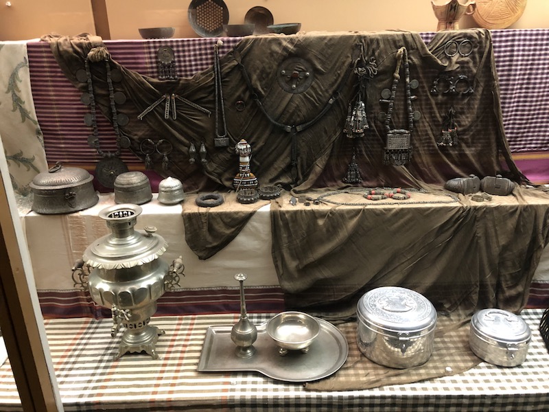
They look cool – but the culture & context is lost due to small or minimal signage and zero explanation of their significance – very unlike the very clear and organized and well-spaced dino exhibits. The accompanying text is also small and texbook-y.
Music from various cultures are played over the speakers as well. The music is nice, but ususally un-related to the exhibit you are currently looking at (e.g. I can hear Middle-eastern-style music from the Japan section).
It is clear that this exhibit/section of the museum needs a tune-up, or at least some more attention. At least 3 windows were not even lit!
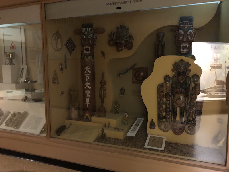
If we were able to make physical changes to the section, I would do the following:
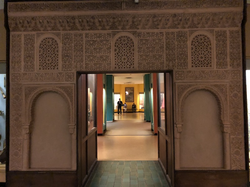
- More archways because they are beautiful and a demonstration of the strong architectural culture from the “Asias”
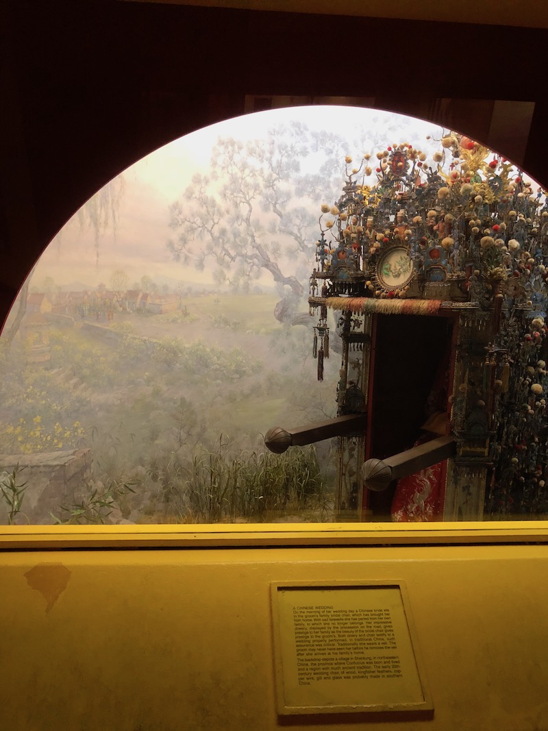
- Remove the sheer quantity of trinkets and replace them with more singular, focused stories. The Chinese wedding piece was my favorite window because it was a focused idea, and also had the same panorama theme as the animals in the exhibit.
Some ideas about how to improve it without changing the content:
- A map app – It says it was designed to be geospatial, but then there are just country/region names, no map context. Making a small map on your phone can return context and scale to the cramped space
- Using reverse image searching matching, create an app that allows visitors to snap a picture of one of the trinkets and get more context about its use, design, and overall significance
- AR to bring these beautiful tapestries to life, and perhaps tell the story or emotions that are being depicted.
