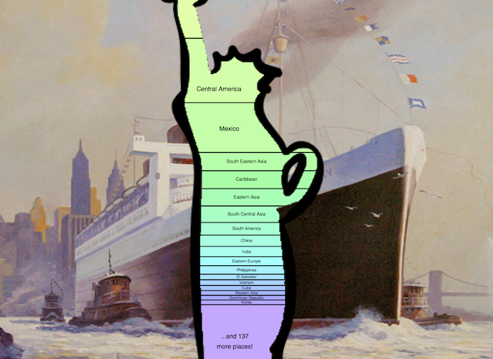
A quick data visualization of immigrant populations to the US – made with using p5.js (and other tools 😈).
Here is the data & code, and here is the editable p5 sketch.
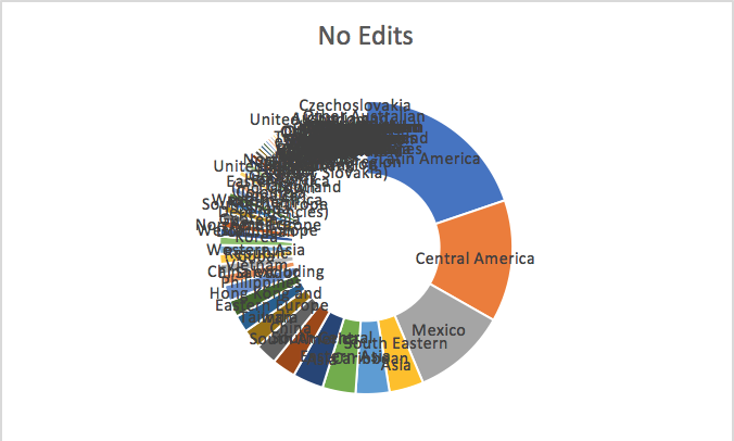
To make this – I customized the raw data after analyzing it in excel, my dear old friend. The excel file is also in the repository and contains other quick-vizes, first to see what a general distribution looked like:

Yuck!
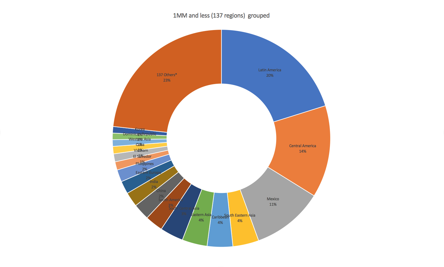
Then lumping in those regions with fewer than 1 Million:

..slightly better. From there I just made some simple rectangles of various HSV colors, and put it behind a cutout of the iconic and inspiring statue of liberty.

